Campaign identity: Protect the Antarctic
Design: Lovers | Creative direction: Greenpeace UK
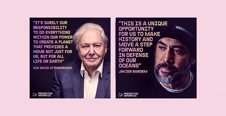
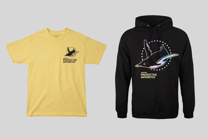
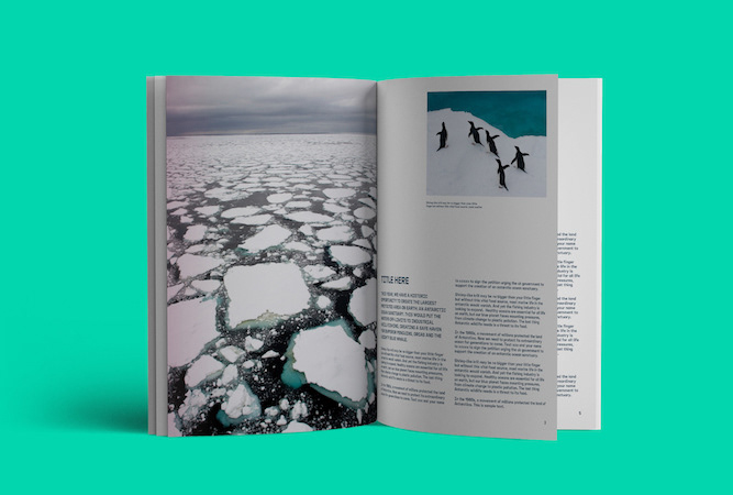
In October 2018, governments responsible for the Antarctic Ocean will decide whether to establish an Antarctic Ocean Sanctuary, the largest protected area on Earth. Working with the design agency Lovers, Greenpeace UK commissioned and art directed a visual campaign that reflected its core aim: to inspire the world to save the Antarctic from destructive overfishing.
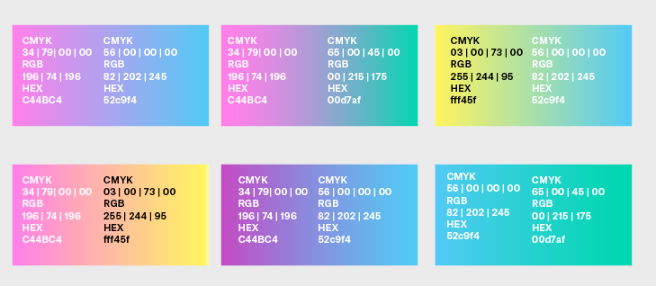

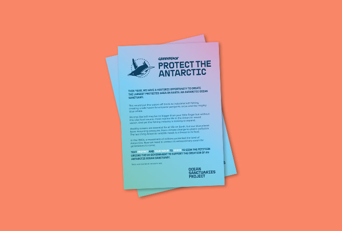
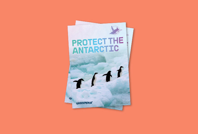
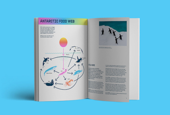
The colour scheme of this campaign was a subversion of stereotypical colours associated with the Antarctic – white and blue. Replacing this traditional association were a wide array of pastel colours, resembling fragmented light or the layout of a heat map.
The typography was a clear and bold, which Lovers' designer Paul Kelly called "strong and sea-faring, which is a nice contrast with the pastel palette". It was inspired by typography on the original Greenpeace ships, drawing inspiration from the 1980s when Greenpeace secured a World Peace Park in Antarctica.
